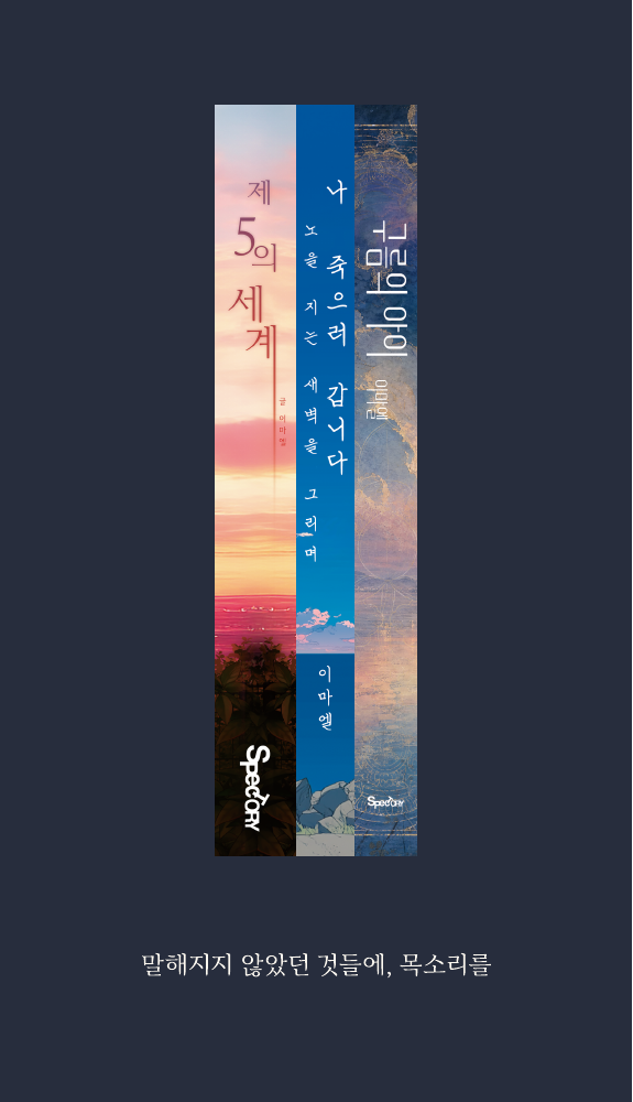
Nanum Myeongjo나눔명조
- Use
- Literature, titles and statements
- Tone
- Depth, resonance and reflection
Example wording존엄은 완벽이 아니라 존재다.
 🇰🇷 KOREAN STORY IP STUDIOGiving voice to the stories left unspoken.
The voice and visual language of SPECTORY.
SPECTORY brings together Spec and Story. Two words, one name.
SPECTORY is a Korean story IP studio. We begin with literature and bring its stories into publishing, animation, audio and new languages.
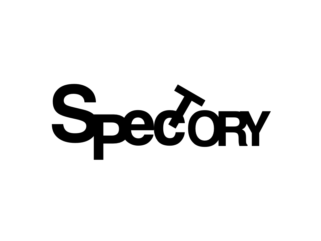
Our wordmark brings letters of different heights and angles into one distinctive form.
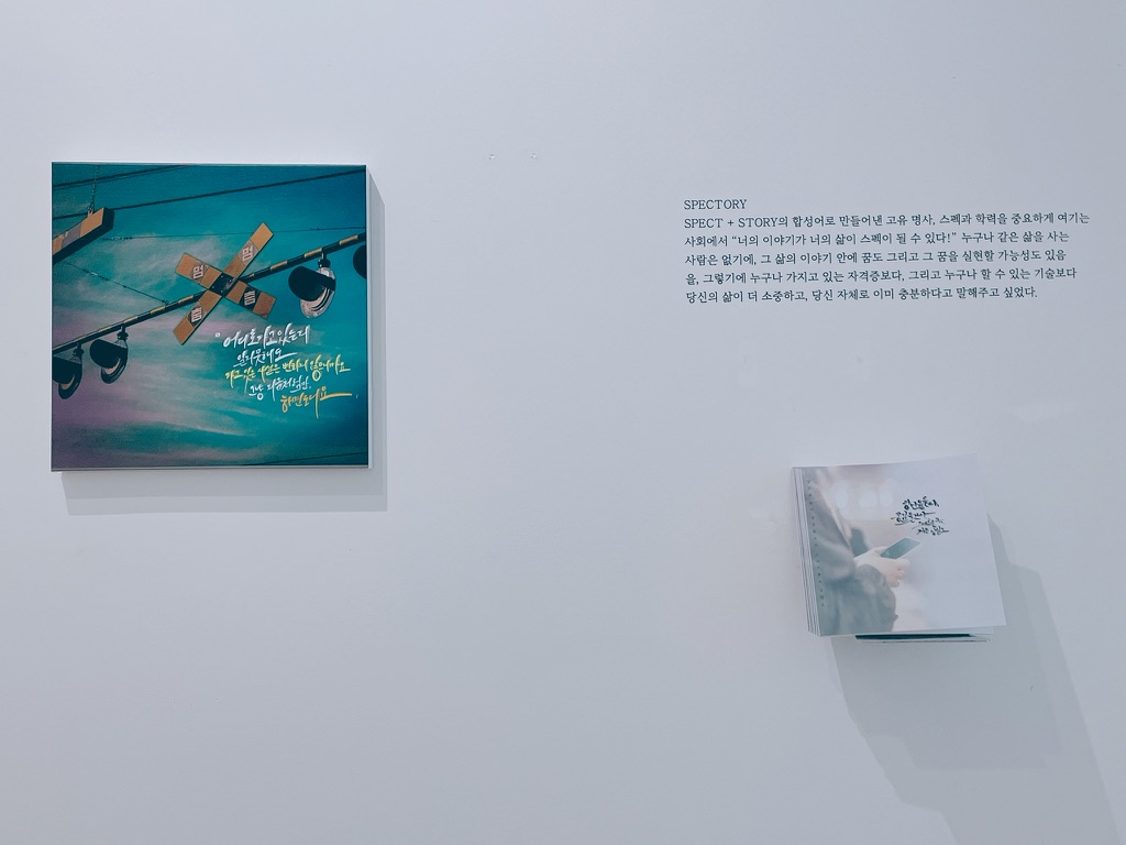
Your story, your life itself, can be your defining strength. No two lives are the same. Each holds a story, a dream, and the possibility of making that dream real. SPECTORY values the life behind a list of qualifications and skills, and the person who is already enough as they are.
Giving voice to the stories left unspoken.
Some feelings remain long before they become words. We turn loss, memory, dignity and recovery into stories that can be shared. Giving voice means helping those stories reach someone, so that no one has to remain alone.
The website uses the wordmark in black and white, leaving space around it so that its silhouette remains clear.
Four colours express SPECTORY’s sense of dignity, recovery and quiet.
Still White#F7F5F2
Stillness after despair; space to breathe.
Rebirth Red#A54B4B
Recovery and the pulse of being alive.
Pulse Gray#B4B2B0
Between feeling and thought; the shadow of existence.
Dignity Black#1C1C1C
The weight of language; the colour of silence.
Sentences and typefaces both breathe. These three typefaces shape our literature and brand materials.
Example wording존엄은 완벽이 아니라 존재다.
Example wording모든 떨림은 살아있다는 증거다.
Example wording삶의 언어는 느리지만 진심이다.
Website reading text and interface labels use Pretendard for clarity.
Humanity · Restraint · Life · Existence · Space · Senses · Dignity
SPECTORY speaks softly, but never silently.
Original PNG files with transparent backgrounds, for introductions and agreed collaborations.
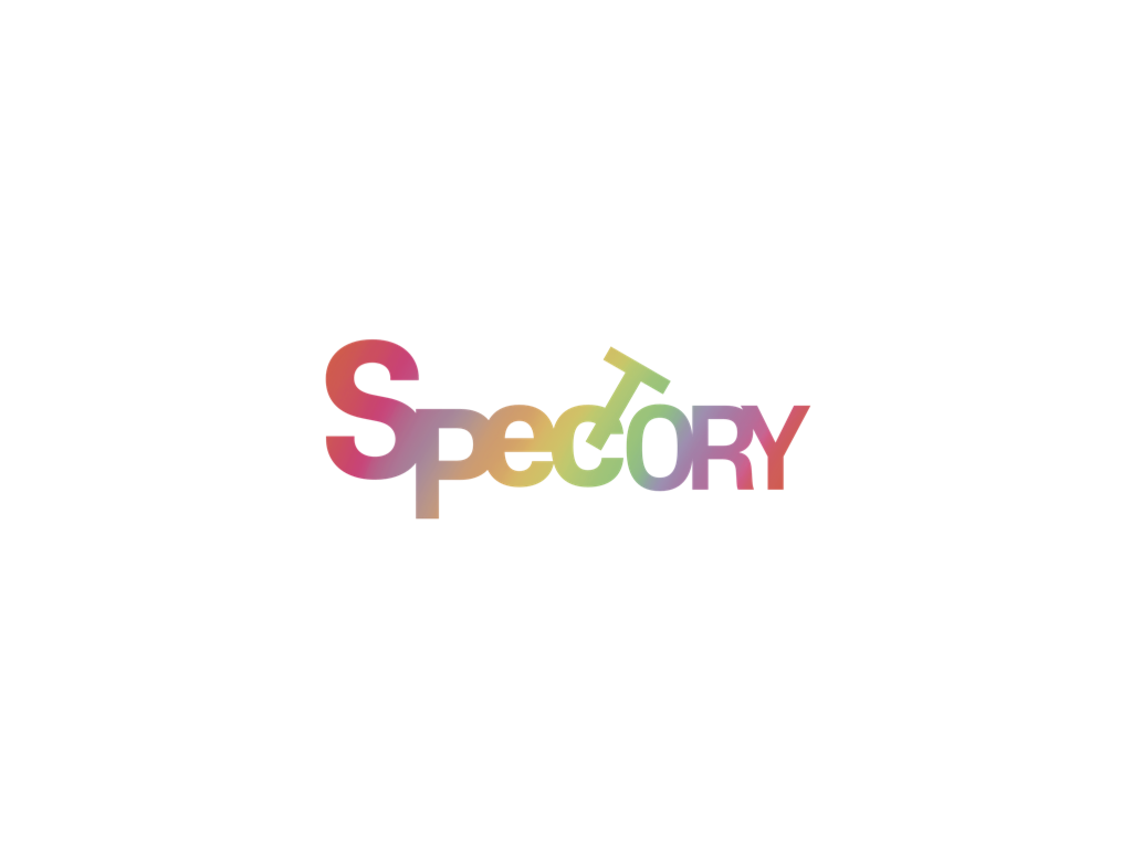 Colour logotype
Find the studio logo and introduction in our press room.